
Best practices for dark mode and theming
Modern enterprise applications — especially Order Management Systems (OMS) — are used for long operational hours. Warehouse operators, support agents, and fulfillment teams stare at screens for 8-12 hours a day.
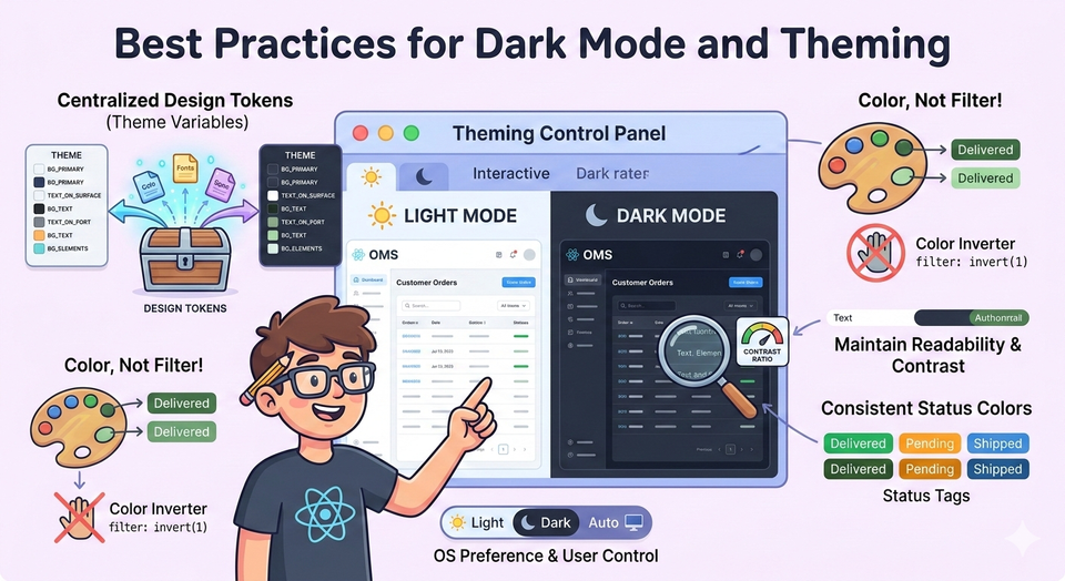
If your UI only supports bright mode, users will feel fatigue quickly.
That is why almost every serious product today supports dark mode + consistent theming.
But theming is not just toggling colors.
In a real OMS:
- Order statuses must remain readable
- Alerts must stay noticeable
- Tables must not lose contrast
- Brand identity must remain intact
- Accessibility must be preserved
So today we will build a production-style theming system in React — not a toy toggle button.
We’ll implement:
- Theme tokens (design system)
- Theme context
- Persistent user preference
- System preference detection
- Component-level usage
- Dark mode safe color strategies
- OMS-style UI (orders dashboard)
You will be able to copy-paste and run it locally.
Prerequisite Knowledge
If you haven't read these yet, they help:
- Context API:
https://thedevlearnings.com/context-api-for-shared-state-and-patterns/ - Local vs Global State:
https://thedevlearnings.com/local-state-vs-global-state-decision-framework-for-react-apps/ - Designing Reusable Components:
https://thedevlearnings.com/designing-reusable-component-systems-2/
Step 1 — Project Structure
Create a new React app:
npx create-react-app oms-theme-demo
cd oms-theme-demo
npm start
Now create the following folders:
src/
 ├── App.js
 ├── index.js
 ├── theme/
 │    ├── ThemeContext.js
 │    ├── themes.js
 │    └── useThemeMode.js
 ├── components/
 │    ├── Header.js
 │    ├── OrderTable.js
 │    ├── StatusBadge.js
 │    └── ThemeToggle.js
 ├── pages/
 │    └── OrdersPage.js
 └── styles/
      └── global.css
Step 2 — Why Dark Mode Is Hard in OMS
In an ecommerce website, colors are mostly decorative.
In an OMS, colors are semantic meaning:
| Color | Meaning |
|---|---|
| Green | Delivered |
| Yellow | Processing |
| Red | Failed |
| Blue | Packed |
| Purple | Awaiting Payment |
If you simply invert colors in dark mode → users misinterpret order status.
So we don’t theme by “background and text”.
We theme by design tokens.
Step 3 — Creating Theme Tokens
Create:
src/theme/themes.js
export const lightTheme = {
  name: "light",
  colors: {
    background: "#f4f6f8",
    surface: "#ffffff",
    textPrimary: "#1f2937",
    textSecondary: "#6b7280",
    border: "#e5e7eb",
    header: "#0f172a",
    headerText: "#ffffff",

    status: {
      delivered: "#16a34a",
      processing: "#f59e0b",
      failed: "#dc2626",
      packed: "#2563eb",
      pending: "#7c3aed"
    }
  }
};

export const darkTheme = {
  name: "dark",
  colors: {
    background: "#0f172a",
    surface: "#1e293b",
    textPrimary: "#f1f5f9",
    textSecondary: "#94a3b8",
    border: "#334155",
    header: "#020617",
    headerText: "#e2e8f0",

    status: {
      delivered: "#22c55e",
      processing: "#facc15",
      failed: "#ef4444",
      packed: "#60a5fa",
      pending: "#a78bfa"
    }
  }
};
Important Observation
Notice status colors change but remain meaningful.
Dark mode is not inversion — it is reinterpretation.
Step 4 — Creating Theme Context
src/theme/ThemeContext.js
import React, { createContext, useContext } from "react";

export const ThemeContext = createContext();

export const useTheme = () => useContext(ThemeContext);
Step 5 — Persist Theme + System Preference
This is real production behavior:
Priority order:
- User preference (localStorage)
- System preference (OS dark mode)
- Default → Light
src/theme/useThemeMode.js
import { useEffect, useState } from "react";
import { lightTheme, darkTheme } from "./themes";

const STORAGE_KEY = "oms-theme";

const getSystemPreference = () =>
  window.matchMedia("(prefers-color-scheme: dark)").matches;

export default function useThemeMode() {
  const [theme, setTheme] = useState(lightTheme);

  useEffect(() => {
    const saved = localStorage.getItem(STORAGE_KEY);

    if (saved === "dark") setTheme(darkTheme);
    else if (saved === "light") setTheme(lightTheme);
    else setTheme(getSystemPreference() ? darkTheme : lightTheme);
  }, []);

  const toggleTheme = () => {
    const next = theme.name === "light" ? darkTheme : lightTheme;
    setTheme(next);
    localStorage.setItem(STORAGE_KEY, next.name);
  };

  return { theme, toggleTheme };
}
Step 6 — Provide Theme to App
src/App.js
import React from "react";
import { ThemeContext } from "./theme/ThemeContext";
import useThemeMode from "./theme/useThemeMode";
import OrdersPage from "./pages/OrdersPage";
import "./styles/global.css";

function App() {
  const { theme, toggleTheme } = useThemeMode();

  return (
    <ThemeContext.Provider value={{ theme, toggleTheme }}>
      <div
        style={{
          background: theme.colors.background,
          minHeight: "100vh",
          color: theme.colors.textPrimary
        }}
      >
        <OrdersPage />
      </div>
    </ThemeContext.Provider>
  );
}

export default App;
Step 7 — Global Styles
src/styles/global.css
body {
  margin: 0;
  font-family: Arial, Helvetica, sans-serif;
}

.table {
  width: 100%;
  border-collapse: collapse;
}

.table th,
.table td {
  padding: 12px;
  text-align: left;
}
Step 8 — Header with Theme Toggle
src/components/ThemeToggle.js
import React from "react";
import { useTheme } from "../theme/ThemeContext";

export default function ThemeToggle() {
  const { theme, toggleTheme } = useTheme();

  return (
    <button
      onClick={toggleTheme}
      style={{
        padding: "8px 14px",
        borderRadius: "6px",
        cursor: "pointer"
      }}
    >
      Switch to {theme.name === "light" ? "Dark" : "Light"} Mode
    </button>
  );
}
src/components/Header.js
import React from "react";
import { useTheme } from "../theme/ThemeContext";
import ThemeToggle from "./ThemeToggle";

export default function Header() {
  const { theme } = useTheme();

  return (
    <div
      style={{
        background: theme.colors.header,
        color: theme.colors.headerText,
        padding: "16px 24px",
        display: "flex",
        justifyContent: "space-between",
        alignItems: "center"
      }}
    >
      <h2>OMS Dashboard</h2>
      <ThemeToggle />
    </div>
  );
}
Step 9 — Status Badge Component
In OMS UI, this is the most important piece.
src/components/StatusBadge.js
import React from "react";
import { useTheme } from "../theme/ThemeContext";

export default function StatusBadge({ status }) {
  const { theme } = useTheme();

  const color = theme.colors.status[status.toLowerCase()];

  return (
    <span
      style={{
        background: color,
        padding: "4px 10px",
        borderRadius: "20px",
        color: "#fff",
        fontSize: "12px",
        fontWeight: "bold"
      }}
    >
      {status}
    </span>
  );
}
Step 10 — Orders Table
src/components/OrderTable.js
import React from "react";
import { useTheme } from "../theme/ThemeContext";
import StatusBadge from "./StatusBadge";

const orders = [
  { id: "ORD101", customer: "Rahul", amount: 1200, status: "Delivered" },
  { id: "ORD102", customer: "Neha", amount: 3400, status: "Processing" },
  { id: "ORD103", customer: "Amit", amount: 899, status: "Failed" },
  { id: "ORD104", customer: "Priya", amount: 2200, status: "Packed" },
  { id: "ORD105", customer: "Karan", amount: 5000, status: "Pending" }
];

export default function OrderTable() {
  const { theme } = useTheme();

  return (
    <table
      className="table"
      style={{
        background: theme.colors.surface,
        border: `1px solid ${theme.colors.border}`
      }}
    >
      <thead>
        <tr style={{ borderBottom: `1px solid ${theme.colors.border}` }}>
          <th>Order ID</th>
          <th>Customer</th>
          <th>Amount</th>
          <th>Status</th>
        </tr>
      </thead>

      <tbody>
        {orders.map(order => (
          <tr key={order.id}>
            <td>{order.id}</td>
            <td>{order.customer}</td>
            <td>₹{order.amount}</td>
            <td>
              <StatusBadge status={order.status} />
            </td>
          </tr>
        ))}
      </tbody>
    </table>
  );
}
Step 11 — Orders Page
src/pages/OrdersPage.js
import React from "react";
import Header from "../components/Header";
import OrderTable from "../components/OrderTable";

export default function OrdersPage() {
  return (
    <>
      <Header />
      <div style={{ padding: "24px" }}>
        <h3>Today's Orders</h3>
        <OrderTable />
      </div>
    </>
  );
}
What You Achieved
You just built a production-level theming architecture:
✔ Centralized design tokens
✔ Dark/light safe status colors
✔ Persisted user choice
✔ OS preference fallback
✔ Reusable UI components
✔ OMS semantic meaning preserved
Best Practices (Real Enterprise Lessons)
1 — Never Hardcode Colors in Components
Bad:
<span style={{ color: "green" }}>Good:
theme.colors.status.deliveredWhy?
Because OMS evolves:
- Cancelled orders added
- Fraud review added
- Return initiated added
You only update theme, not 200 components.
2 — Do NOT Invert Colors
Never do:
filter: invert(1);Warehouse agents depend on color memory.
If red suddenly becomes pink → mistakes happen.
3 — Dark Mode Needs Different Contrast Ratios
Light mode contrast ratio: ~4.5:1
Dark mode preferred: ~7:1
That’s why dark text is not pure white (#fff).
We used:
#f1f5f9Less strain on eyes.
4 — Status Colors Must Change Between Themes
Bad dark mode:
Green on black = invisible.
So we brightened them:
light: #16a34a
dark:  #22c55e
5 — Theme is Global State (Not Local)
Relates to:
https://thedevlearnings.com/local-state-vs-global-state-decision-framework-for-react-apps/
Theme affects entire UI → must be global.
Context is perfect for it:
https://thedevlearnings.com/context-api-for-shared-state-and-patterns/
6 — Don’t Store Entire Theme in LocalStorage
Store only:
light / darkNever store full JSON theme → breaking changes after deployments.
7 — Tables Need Special Care in Dark Mode
OMS screens = mostly tables.
Problems in dark mode:
- Row borders disappear
- Hover effects vanish
- Selected rows unreadable
Solution:
Use surface + border tokens — not background variations.
Advanced Thought (How Real OMS Does It)
Large companies actually use 3 layers of theming:
- Brand Theme (company identity)
- Functional Theme (warehouse vs support vs finance)
- User Preference (dark/light)
Our architecture already supports this — you would just add more theme objects.
You Are Now Ready For…
Dynamic per-client theming:
Same OMS deployed for multiple brands — each with their own colors.
Exactly how Shopify, Salesforce OMS, and enterprise OMS platforms work.
Related Previous Articles
Helpful continuation:
- Reusable component systems:
https://thedevlearnings.com/designing-reusable-component-systems-2/ - Memo optimization (important when theme changes):
https://thedevlearnings.com/react-memo-usecallback-for-smoother-apps/ - Server vs client state:
https://thedevlearnings.com/server-vs-client-state-management/
Final Thoughts
Dark mode is not a UI feature.
It is an operational safety feature in enterprise systems.
A badly implemented theme:
- Causes order mistakes
- Slows operators
- Increases fatigue
A well-implemented theme:
- Improves productivity
- Reduces errors
- Makes your React app enterprise-ready
And now — your OMS UI supports real production theming.
Next Article
Fetch API and Axios: error handling and patterns
Member discussion